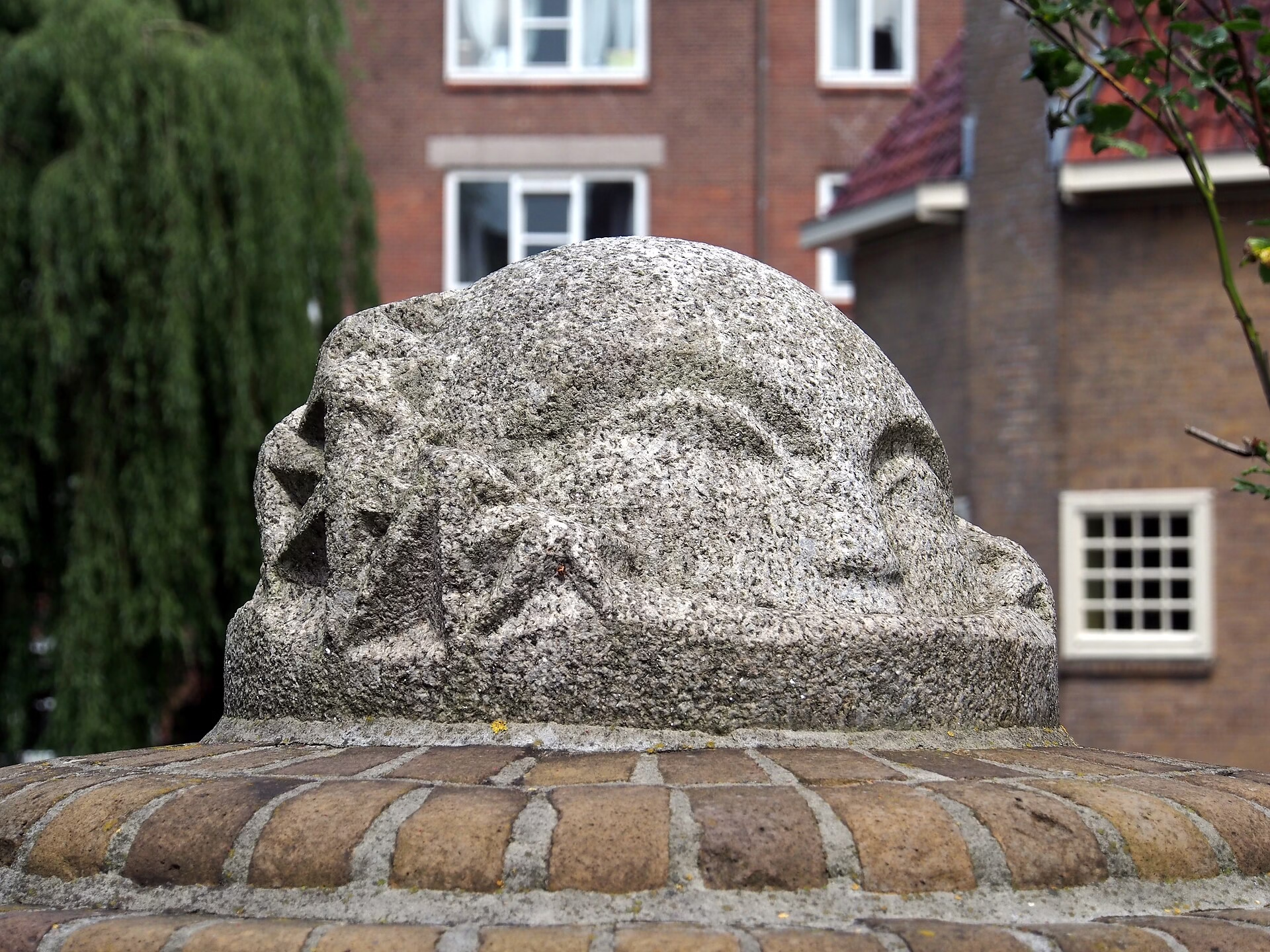
One Architect, One Sculptor, and Hundreds of Bridges
If you have walked over more than a dozen bridges in Amsterdam, you have walked over a Piet Kramer. He designed somewhere between two hundred and five hundred of them across four decades, depending on whose count you trust, and the style he worked in, the Amsterdam School, is so thoroughly the house manner of the city’s crossings that even bridges he never touched look like his.
Kramer is mentioned in more than fifty of the bridge posts on this site, and the Amsterdam School in more than half of them. This is the article those mentions have been pointing at.
How a Municipal Department Acquired a House Style
Piet Kramer (1881 to 1961) joined the Dienst der Publieke Werken, Amsterdam’s Public Works department, in 1911, initially as assistant to the aesthetic advisor Van der Mey. In 1917 the engineer Wichert Arend de Graaf appointed him aesthetic advisor to the Bridges department, and he stayed with the municipality for four decades.
Consider what that job title means. A municipal engineering department employed a designer whose formal responsibility was how the bridges looked. Not their load capacity, not their cost, but their appearance. The city took the view that a crossing over a canal was a public object that people would live with for a century, and that it was worth paying an architect to make it good.
The output was extraordinary. Joseph Buch’s survey of Dutch architecture puts it at about two hundred bridges and other accounts at nearly five hundred, in every part of the city, from the grand canal crossings of the centre to dozens of wooden bridges in the Amsterdamse Bos.

What an Amsterdam School Bridge Actually Looks Like
The style is easier to recognise than to define, but a few things recur.
- Sculptural brickwork. The brick is not cladding over a structure, it is treated as a mass to be shaped. Wings step, curve and taper.
- Expressive abutments. The heavy ends where the bridge meets the quay get the most attention, often stepping down toward the waterline in blocks of natural stone.
- Ironwork. Railings and lamp standards designed as part of the composition rather than bought from a catalogue.
- Sculpture, integrated from the start rather than applied afterwards.
- A design meant to be seen from the water, not only walked across. This is the giveaway. Stand on an Amsterdam School bridge and you see very little. Pass underneath it in a boat and the whole thing makes sense.
Bridge 68, the Aalmoezeniersbrug on the Leidsestraat, is the clearest example in the centre. Built to Kramer’s design in 1921, its brick wings step horizontally down to blocks of natural stone at the waterline, capped by four sculpted plates of grey granite carrying mythical creatures. Tens of thousands of people cross it every week. Almost none of them have seen the creatures, because you cannot see them from the deck.
Kramer and Krop
The sculpture on those bridges is usually the work of Hildo Krop, the city sculptor, and the Kramer and Krop partnership is the reason Amsterdam’s public works of this period look like art rather than infrastructure.
Most of the bridges Krop provided sculpture for were Kramer designs. The two of them were given room, inside a municipal department, to put a personal artistic signature on ordinary public works. That is a remarkable institutional decision, and it is worth being clear about how unusual it is: this was not a prestige commission or a monument fund. It was the routine bridge-building budget of a city council, spent on original sculpture.
The Aalmoezeniersbrug’s creatures were designed by Krop in 1916 for a bridge completed in 1921, which tells you how far ahead these schemes were planned and how integrated the sculptural and structural work was.

The Style Outlived the Man
Here is the part that surprises people. A great many of Amsterdam’s Amsterdam School bridges are not by Kramer at all.
Bridge 69, at the Spiegelgracht, dates from 1951 and was designed by the Public Works department rather than by Kramer personally. It nonetheless carries clear marks of his hand, particularly in the piers. By the middle of the century the department had absorbed his vocabulary so completely that a bridge produced by the office still spoke with his accent, decades after the movement itself had passed.
That is what it means for an institution to acquire a style. One designer sets the manner, the office learns it, and the manner keeps producing bridges long after the designer has moved on. It is also why dating an Amsterdam bridge by eye is unreliable: the look persisted for forty years after it stopped being fashionable anywhere else.

Where to See Them
- Bridge 68, Aalmoezeniersbrug, Leidsestraat over the Prinsengracht. Kramer, 1921, with Krop’s granite creatures at the waterline.
- Bridge 43, where the Utrechtsestraat meets the Keizersgracht. Trams still run over carved beasts.
- Bridge 63, the Nieuwe-Wercksbrug, beside the Westerkerk. Built 1925 from a 1923 Kramer design, and a national monument.
- Bridge 36, the Lucas Jansz. Sinckbrug, a Kramer design named for the surveyor who laid out the canal ring three centuries earlier.
- Bridge 69, Spiegelgracht. Not Kramer, but unmistakably his idiom, thirty years later.
See them from the water if you can. They were designed for that view.
Sources Consulted
- Featured image: Hildo Krop sculpture on Bridge 404 by Alf van Beem, 2016, via Wikimedia Commons, Public domain
- Hildo Krop, Wikipedia
- Piet Kramer, Amsterdam op de kaart
- Piet Kramer: Bruggenbouwer van de Amsterdamse School, EFL Stichting
- Museum Het Schip, Amsterdam School collection
- Bruggen van Amsterdam, Nederlandstalige Wikipedia