
If you walk through Amsterdam long enough, you will eventually feel a pair of stony eyes watching you. They might belong to a granite faun peering from a canal wall or a stoic worker carved into the pillar of a massive drawbridge. These figures are not random ornaments; they are the lifework of Hildo Krop, the man who spent forty years as the official City Sculptor (Stadsbeeldhouwer) of Amsterdam.
Between 1916 and his death in 1970, Krop transformed the city’s functional infrastructure into a sprawling, open-air gallery. His work was the finishing touch on the Amsterdam School (Amsterdamse School) architectural movement, an expressionist style characterized by rounded brickwork, decorative masonry, and a deep belief that public utilities should be beautiful. Krop’s genius was his ability to marry the heavy, industrial needs of a growing city with the delicate, symbolic power of myth and folklore.
The Partnership of Stone and Steel: Krop and Kramer
The “face” of modern Amsterdam was largely defined by a singular partnership between Hildo Krop and the bridge architect Piet Kramer. Working within the Public Works department, Kramer designed hundreds of bridges, while Krop provided the sculptural soul for them. They viewed a bridge not merely as a way to cross water, but as a total work of art (Gesamtkunstwerk).
Kramer’s bridges provided the perfect stage. He often designed massive granite bridgeheads and iron railings that cried out for ornamentation. Krop responded by carving directly into the primary building materials, usually dark Norite or gray granite. This integration meant the art was never “glued on” to the bridge; it was a fundamental part of the structure’s skeleton. Together, they turned mundane canal crossings into monuments of civic pride.
Three Masterpieces of the Amsterdam School
To truly understand Krop’s legacy, one must look at his work in situ. These three bridges represent the peak of his collaboration with the city’s architects.
1. Bridge 400: The P.L. Kramerbrug, Amsteldijk
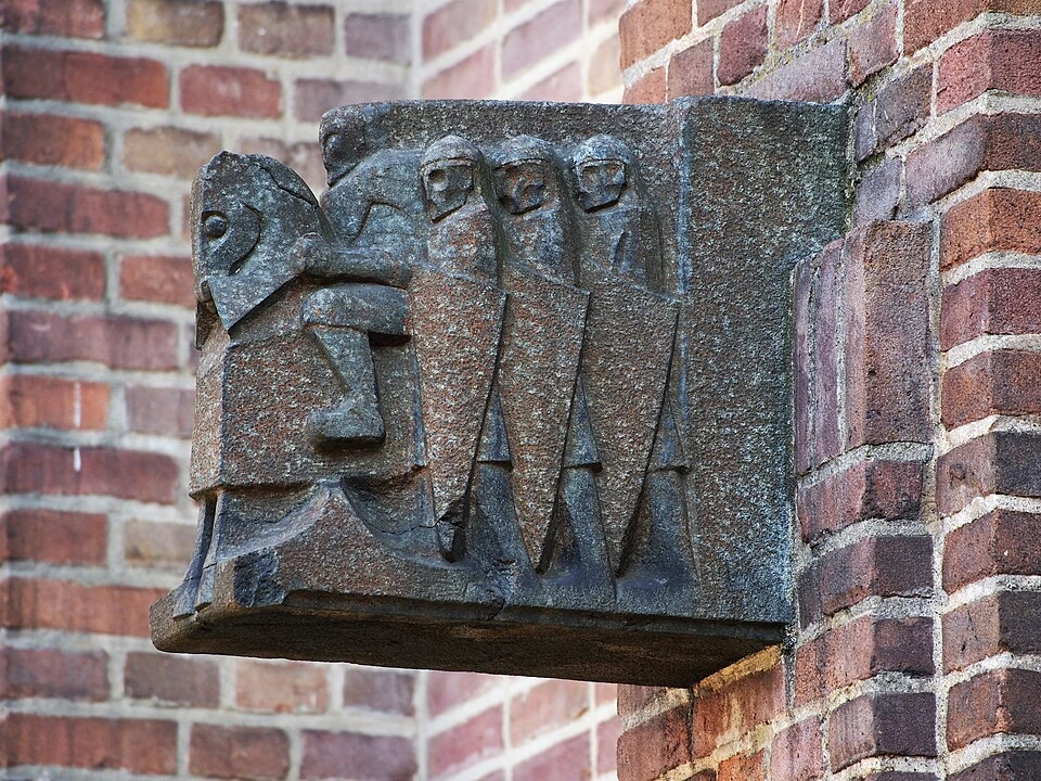
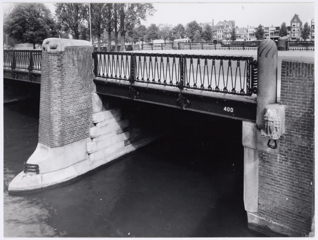
Bridge 400 is the P.L. Kramerbrug, which carries the Amsteldijk over the Amstelkanaal in Amsterdam-Zuid, a short walk upstream of the Berlagebrug. Piet Kramer drew it in 1917 and it was built between 1919 and 1922. It is a quintessential example of how Krop used animal motifs to humanise large scale infrastructure: the capstones on the head piers are cut as sea creatures, seals, set into the alternating courses of brick and natural stone. They are not depicted with photographic realism; instead they are carved with the chunky, expressive lines typical of the Amsterdam School.
The choice of seals is symbolic of the city’s relationship with the water, but it also reflects Krop’s personal interest in the natural world. They are not the only carvings here. Between the abutments and the bridge there are knights on the Amstel side, and Gijsbrecht van Aemstel with a cog ship on the canal side, and the stone pillars on the deck carry rising grooves of their own. By placing these heavy forms on a working traffic artery, Krop provided a sense of wonder for the thousands of commuters passing by. The stone has held its edges through a century of Dutch weather, and the bridge was listed as a rijksmonument in 2004.
2. Bridge 405: The Hanny Michaelisbrug, Stadionweg
Bridge 405 is the Hanny Michaelisbrug, which carries the Stadionweg over the Noorder Amstelkanaal and lands on the Hobbemakade. Piet Kramer built it around 1927 for Public Works, one of four bridges that enclose the stretch of water known as De Kom, laid out with its neighbour bridge 406 under Berlage’s Plan Zuid. Kramer mixed brick and granite over steel girders, and carried the Amsterdam School through to the wrought iron railings, the granite piers, and the lettering of the year stones reading anno 1927.
Krop’s granite figures stand around the bridge rather than on it, and they are the reason to come. There is a faun with a guitar and a faun playing an accordion, and there are serpents, and a man and a woman. The fauns are the best argument anyone has made for Krop as something other than a solemn sculptor of civic virtue: they are musicians, caught mid-tune, on a traffic bridge. The bridge itself went unnamed for most of its life. Locals called it the Mozartbrug after the Mozartkade along the south bank, the city asked residents in 2016 whether to make that official and they chose to leave it anonymous, and only in July 2022 was it named for the poet Hanny Michaelis. The nameplate went up on 19 December 2022.
3. The Berlagebrug (Berlage Bridge 423)
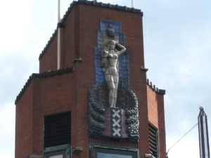
This is perhaps the most iconic of all Krop’s bridge projects. Named after the legendary architect H.P. Berlage, this massive crossing over the Amstel river acts as the southern gateway to the city center. Krop’s contribution here is a towering monumental column topped with a figure known as the “Genius of Amsterdam.”
Clad in shimmering ceramic tiles and carved stone, the sculpture depicts a seated figure rising out of the water, flanked by symbols of the city’s maritime power. It is a work of immense gravity and dignity. The Berlagebrug shows Krop working at his most formal and ceremonial level, creating a landmark that tells the story of Amsterdam as a global capital of trade and culture.
Motifs and Materials: The Language of Krop
Hildo Krop had a distinct visual vocabulary. He favored hard, durable stones like Norite and granite because they allowed for bold, simplified shapes that could be seen from a distance. His style was influenced by both European expressionism and traditional Indonesian wood carving, resulting in a look that felt both ancient and modern.
His recurring motifs include:
- Animals: Seals, fauns, dogs, and owls appear constantly, often used as guardians of the bridge.
- Labor: Figures of smiths, dockworkers, and masons celebrate the blue collar workforce that built the city.
- Mythology: Mermaids, giants, and classical gods are woven into the urban fabric to give the city a sense of timelessness.
A Walking Tour: Where to See Krop’s Work
If you want to experience a high concentration of Krop’s work, the Rivierenbuurt (River Neighborhood) is your destination. Developed in the 1920s and 1930s, this area is a living museum of the Amsterdam School. Nearly every bridge in this district features a “Krop original,” usually tucked into the corners where the brick meets the water.
Must-See Krop Bridges for Your Itinerary:
- Bridge 401 (Diepenbrockstraat): Look for the stunning “Woman with Gazelle” sculpture.
- Bridge 419 (Stadionweg): Features a beautiful depiction of a mother and child.
- The Amstel Bridge (Brug 101): Includes his famous sculptures of sea creatures on the bridgeheads.
- The Hildo Krop Museum: Located in Steenwijk (outside Amsterdam), this is his birthplace and holds many of his smaller models and sketches.
https://www.hildokropmuseum.nl/
The Face of the City
Today, Hildo Krop’s sculptures are so deeply embedded in the city that many residents walk past them without a second thought. Yet, it is his work that prevents Amsterdam from feeling like a sterile grid of concrete and steel. By turning every bridge into a story, Krop ensured that even the most functional parts of the city remained connected to the human spirit. He didn’t just build bridges; he gave them a voice that continues to speak to the people of Amsterdam over a century later.
Photographing Hildo Krop’s sculptures requires a bit of a “hunter’s eye” because his work is integrated into the bridgeheads, often sitting just above the water line or tucked into the masonry.
Here is a guide to the best angles and lighting for the bridges we discussed.
General Photography Tips for Krop Sculptures
- The “Golden Hour” Strategy: Because most of his work is in gray granite or dark Norite, midday sun can wash out the details. Shoot during the hour after sunrise or hour before sunset to let the side-lighting highlight the texture of the stone.
- Go Low: Many of Krop’s best details are on the abutments (the parts of the bridge that meet the shore). If you can, walk down to the canal path under the bridge to get an “upward” angle that makes the figures look more monumental.
- The Detail Lens: Bring a zoom lens (70mm to 200mm). Many sculptures are across the water from the pedestrian path, and you’ll want to “pull” the texture of the stone into the frame.
Bridge-Specific Photo Guide
Bridge 400 (Amsteldijk) – The Seal Guardian
- Best Angle: Approach from the northwest corner of the bridge. Stand on the sidewalk and look slightly down toward the water.
- The Shot: Frame the seal sculpture in the foreground with the water of the Amstelkanaal stretching out behind it. This creates a great sense of place.
- Lighting: This bridge is best in the late afternoon when the sun hits the southern side of the stonework, bringing out the “rippling” effect of the waves Krop carved around the seals.
Bridge 405 (Stadionweg) – The Musician Fauns
- Best Angle: Work the bank rather than the deck. Drop down to the Mozartkade on the south side, where the figures sit at eye level instead of above you.
- The Shot: The faun with the accordion. Shoot it in profile so the instrument reads against the sky, and keep the granite pier in frame so the sculpture stays attached to the bridge it belongs to. The anno 1927 year stone is worth a frame of its own.
- Lighting: Granite this pale flattens in hard sun. A bright overcast day will hold the chisel marks, and low side light late in the day will pull the carving out against the red brick.
The Berlagebrug – The Genius of Amsterdam
- Best Angle: Stand on the Weesperzijde (the riverbank path) on the north side of the bridge.
- The Shot: This is a “tall” shot. Position yourself so the sculptural tower is framed by the river. If you have a wide-angle lens, you can capture the entire span with the “Genius” figure as the focal point.
- Lighting: Sunset is the magic time here. The ceramic tiles in the “Genius” sculpture catch the orange light, and the gold sun behind the figure’s head actually seems to glow.
Pro Tip: The “Muzenplein” Cluster
If you want to fill your camera roll quickly, head to Muzenplein. It’s the park right next to Bridge 419 (Hildo Kropbrug).
- From the center of the park, you can see a high concentration of Krop’s work, including the nine child statues by his contemporaries.
- It is a quiet spot where you can take your time with a tripod without the usual Amsterdam bike traffic rushing past you.
The Scheepvaarthuis: Krop’s Professional Launchpad
Before he was the official City Sculptor, Hildo Krop was a young artist finding his footing in the studio of Hendrik van den Eijnde. It was here that he contributed to the Scheepvaarthuis (Shipping House), the building that effectively birthed the Amsterdam School style. While Van den Eijnde was the lead designer for the facade, Krop was responsible for a significant number of the building’s smaller, intricate details.
Krop specifically carved 13 of the 15 granite console portraits that ring the building. These represent historical figures like explorers Willem Barentsz and Jacob van Heemskerck. He also designed the stone plinth decorations and the distinctive typography for the name “‘t Scheepvaarthuis” on the exterior. This project was a turning point for Krop; it was where he first mastered working with compressed-air hammers to carve hard granite and diorite. For the bridgehunter, seeing these portraits is like seeing the “rough drafts” of the bold, expressive style he would later bring to the city’s canal crossings.
Photography Tips for the Amrath
- The Console Portraits: To see Krop’s specific handiwork, look for the row of heads carved into the granite blocks just above the ground floor. You will need a zoom lens to capture the weathered, stoic expressions of the explorers.
- The Lettering: Look at the base of the building (the plinth). The stylized, chunky letters spelling out the building’s name are Krop’s design and are a perfect example of Amsterdam School typography.
- The Binnenkant Side: Some of Krop’s most interesting “maritime” details, like schools of fish and waves, are located on the quieter side of the building along the Binnenkant canal.
| Location | Bridge/Building No. | Primary Theme | Material |
| Amsteldijk | Bridge 400 | Fauna (Seals) | Brick & Natural Stone |
| Stadionweg | Bridge 405 | Fauns & Serpents | Granite |
| Berlagebrug | Bridge 423 | The Genius of Amsterdam | Ceramic & Stone |
| Grand Hotel Amrath | Scheepvaarthuis | Maritime History & Oceans | Sandstone & Granite |
Stadhouderskade 1
The building at Stadhouderskade 1 was put up in 1922 and 1923 by the city’s Dienst der Publieke Werken as the head office of the Gemeentetram, the municipal tram company. The architect was Pieter Lucas Marnette, who worked for Public Works, and he designed it in the Amsterdam School style used all along this stretch of the Singelgracht. In the early years a siding ran along the west side for the money tram, which brought the conductors’ ticket takings in to the counting house under guard. It is a fascinating stop on any Hildo Krop tour. It stands on one of the busiest corners in the city, with the Leidsebosje to its southeast, and most people rush past without noticing the stonework on the facade.
Krop provided the sculptural ornamentation while the building went up, just as his reputation as the city’s sculptor was becoming ironclad. He cut a long series of facade stones that illustrate his shift toward the heavy, symbolic style of the Amsterdam School, with stoic faces and muscular forms that seem to emerge directly from the brickwork. The building has been a rijksmonument since 2001, number 491984, and the listing names Krop’s work as part of what is protected.
The Facade Stones
Krop’s work here is not one monument but a run of carved stones set into the brick, and the pleasure of the building is finding them. His signature is on full display: deep, V-shaped grooves in the stone and simplified, almost blocky anatomy. They give a heavy, grounded counterweight to the water behind the building and the constant motion of the trams in front of it, which is the point, because the trams are what the building was for.
For the bridgehunter, this building is a vital link between Krop’s bridge work and his architectural commissions. It shows how he used the same visual language, stone, muscularity and stoicism, to give a face to a municipal office just as he did for the public spans across the Amstel. The tram company left in 1983 for the Scheepvaarthuis, the city’s street cleansing department took the building over, and only after 1990 did it pass into private hands.
Photography Tips for Stadhouderskade 1
- The “Traffic Gap”: Because this is one of the busiest spots in the city, the best time to photograph is early Sunday morning. You’ll have a much better chance of getting a clear shot of the entrance without a tram or tour bus blocking the view.
- The Upward Angle: Stand directly across the street near the edge of the Leidsebosje park. Use a zoom lens to pick individual facade stones off the brickwork. Shooting from a low angle emphasises the “monumental” feel that Krop intended.
- Texture Detail: The granite here is particularly dark. To capture the texture of the chisel marks, wait for a slightly overcast day. The soft, flat light will prevent the dark stone from becoming a “black hole” in your photos and allow the subtle carvings to pop.
Corrections
Updated 25 September 2026. This piece originally placed bridge 400 on the Parnassusweg and described Stadhouderskade 1 as a former headquarters of the Cuypers architectural practice. Both were wrong. Bridge 400 is the P.L. Kramerbrug on the Amsteldijk, and Stadhouderskade 1 was built in 1922 and 1923 as the head office of the Gemeentetram. Thanks to @amsterdamseschool.bsky.social for pointing both out. Checking those led to a third correction: the second bridge described here was numbered 422, which is the Jeroen Oerlemansbrug over the Boerenwetering. The Krop bridge at the Hobbemakade is bridge 405, the Hanny Michaelisbrug, and that section has been rewritten accordingly.