
Amsterdam has hundreds of historic bridges but Spijkenisse just outside Rotterdam has a unique set of bridges worth a day trip!
Also check out my photo album on Google Photos. This post was originally an instagram story so there is a heavy reliance on images. Scroll to read a text version.


In contrast to the historical and deeply ornamental “Brick Expressionism” of Piet Kramer, the Eurobruggen (Euro Bridges) in Spijkenisse represent a playful, modern, and conceptual approach to Dutch infrastructure.
While Kramer’s bridges were built to create a unique local identity for Amsterdam, the Spijkenisse bridges were built to turn a pan-European “fiction” into a physical reality.
1. The Concept: Turning “Nowhere” into “Somewhere”
When the Euro was introduced in 2002, the European Central Bank (ECB) faced a diplomatic challenge: how to depict bridges on banknotes without favoring any specific country. The solution, designed by Robert Kalina, was to create seven fictional bridges, each representing a different era of European architectural history.
In 2011, Dutch designer Robin Stam realized that if the bridges didn’t exist anywhere, they could exist in the Netherlands. He proposed building exact replicas of these “financial fictions” in the new residential district of Het Land in Spijkenisse.
2. A Chronology of Styles
The bridges are organized by the denomination of the banknote they represent. Much like Kramer’s work, they serve as a historical tour, though they cover a much broader timeline:
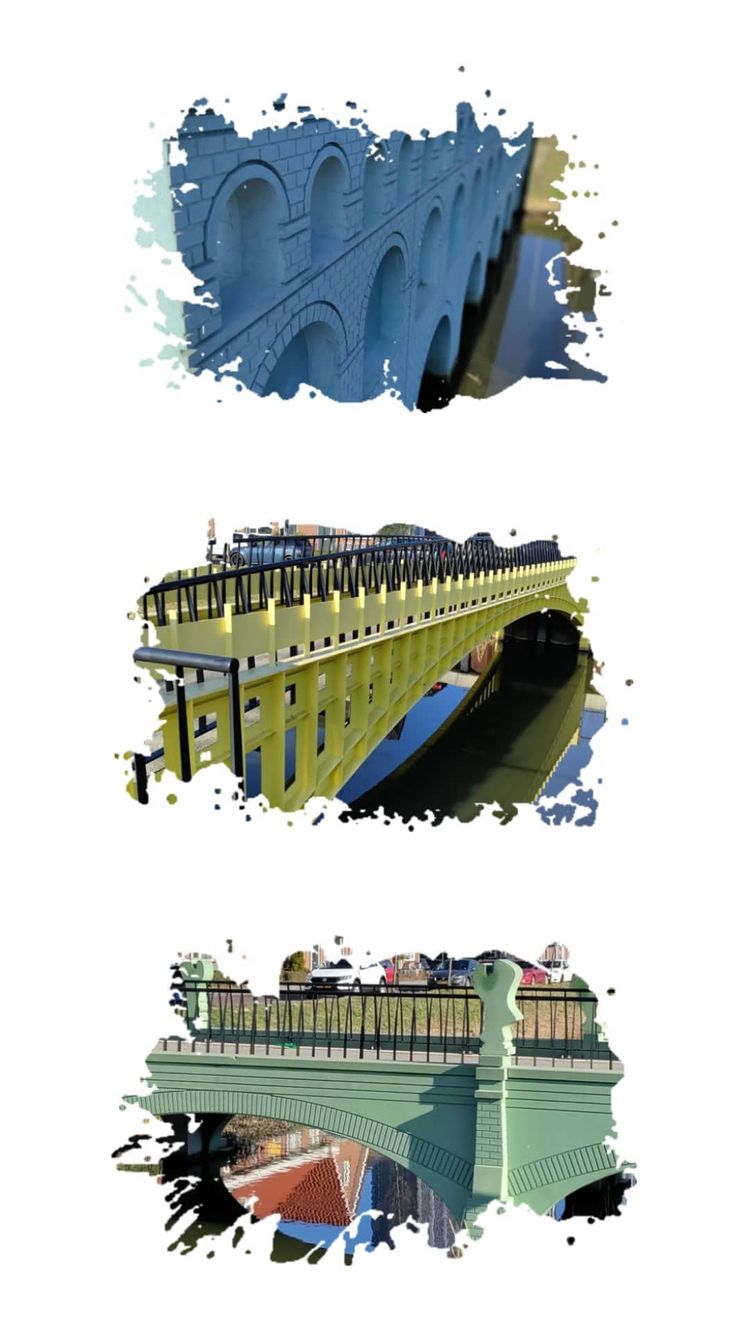
€5 Bridge (Classical): Modeled after the grey antiquity of Roman aqueducts.
€10 Bridge (Romanesque): A sturdy, red structure with rounded arches.
€20 Bridge (Gothic): Features the signature pointed arches and blue color of the 20 Euro note.
€50 Bridge (Renaissance): A bright orange bridge reflecting the symmetrical, classical revival.
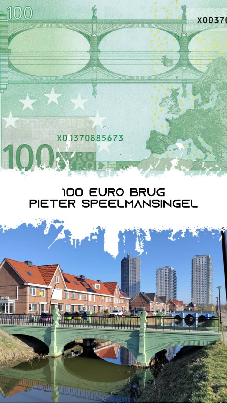
€100 Bridge (Baroque and Rococo): A green bridge with the more elaborate, curvy ornamentation of the 17th and 18th centuries.
€200 Bridge (Iron and Glass): Represents the industrial age, built with a yellow hue.
€500 Bridge (Modern 20th Century): A purple cable stayed bridge representing contemporary architecture.
3. Materials and Construction
Unlike the hand laid brickwork of Kramer’s era, these bridges utilize modern industrial techniques to achieve their “printed” look:
Colored Concrete: To match the exact shades of the banknotes, Stam used color matched concrete. Most of the bridges were made by pouring dyed concrete into custom wooden molds.
The “Kitschy” Aesthetic: The designer intentionally kept the bridges looking like the 2D illustrations on the bills. They often have a flat, stage set quality, which some critics called “folly architecture.”
Hybrid Structures: For the €5 and €20 notes, Stam cleverly designed a single bridge where each side represents a different banknote, maximizing the visual impact for the residential crossings.
Steel vs. Concrete: While the smaller “historical” bridges are primarily concrete, the modern €200 and €500 bridges are constructed from steel to reflect their respective industrial and contemporary eras.
4. Cultural Impact and Irony
The project gained international fame for its irony. The ECB’s goal was to ensure the bridges remained “neutral” and unclaimed by any nation, but by building them, Spijkenisse effectively “claimed” the Euro for the Netherlands.
The bridges even include specific “photo spots” where the perspective perfectly matches the angle of the bridge as it appears on the back of the currency. While some residents initially viewed them as an expensive joke, they have become a major point of “applied art” tourism, proving that even in the modern era, Dutch bridge design continues to be a medium for storytelling and cultural identity.
Pieter Speelmansingel, Spijkenisse, NL is the location of this amazing set of bridges designed by Dutch artist Robin Stam. A decade after the Euro notes began circulating around Europe he started toying with the idea of turning these infrastructre fictions into physical realities. With help from designers and engineers all over the Netherlands and the okay from the local council.
The resulting set of bridges arrayed around a small neighbourhood south of Rotterdam are painstakingly precise recreations of the imaages on the reverse of the notes, right down to the bright colours associated with the banknote artwork using colour matched concrete.
The 5 Euro Brug is located on Pieter Speelmansingel whilst the 10 Euro Brug is around the corner on Gerard Fonkertsingel.
The designer Robin Stam is a brand specialist. He created these bridges in his home town in 2013.
The 20 Euro Brug is also located on Gerard Fonkertsingel.
The scale of the bridges is somewhat loosely interpreted as each bridge is shrunk down into pedestrian crossings and they are composed of a concrete crossing with a prefabricated facade.
Back on the Pieter Speelmansingel is the 50 Euro Brug and the 100 and 200 Euro Bruggen with the final 500 Euro Bridge being back on Gerard Fonkertsingel.
Real bridges based on the Euro banknote artwork! The Euro became the basis for a series of real-life structures, meticulously modelled after fake structures on the back of Euro notes. Find them at Spijkenisse in the Netherlands.
Originally posted on Instagram @bruggenvanamsterdam

Address and visitor information
The Euro bank note bridges
Address: Gerard Fonkertsingel
3201 MA Spijkenisse
Near: Rotterdam
Province: Zuid-Holland
Visit: The Euro bridges are located on both sides of a very residential area with not much else to do so you should allow approximately 1 hour for your visit.
At the Gerard Fonkertsingel you will find the 500, 10 and 20 euro bridges and at the Pieter Speelmansingel you will find the 5, 50, 100 and 200 euro bridges.